H II O
The convergence of hydrological and ecological values
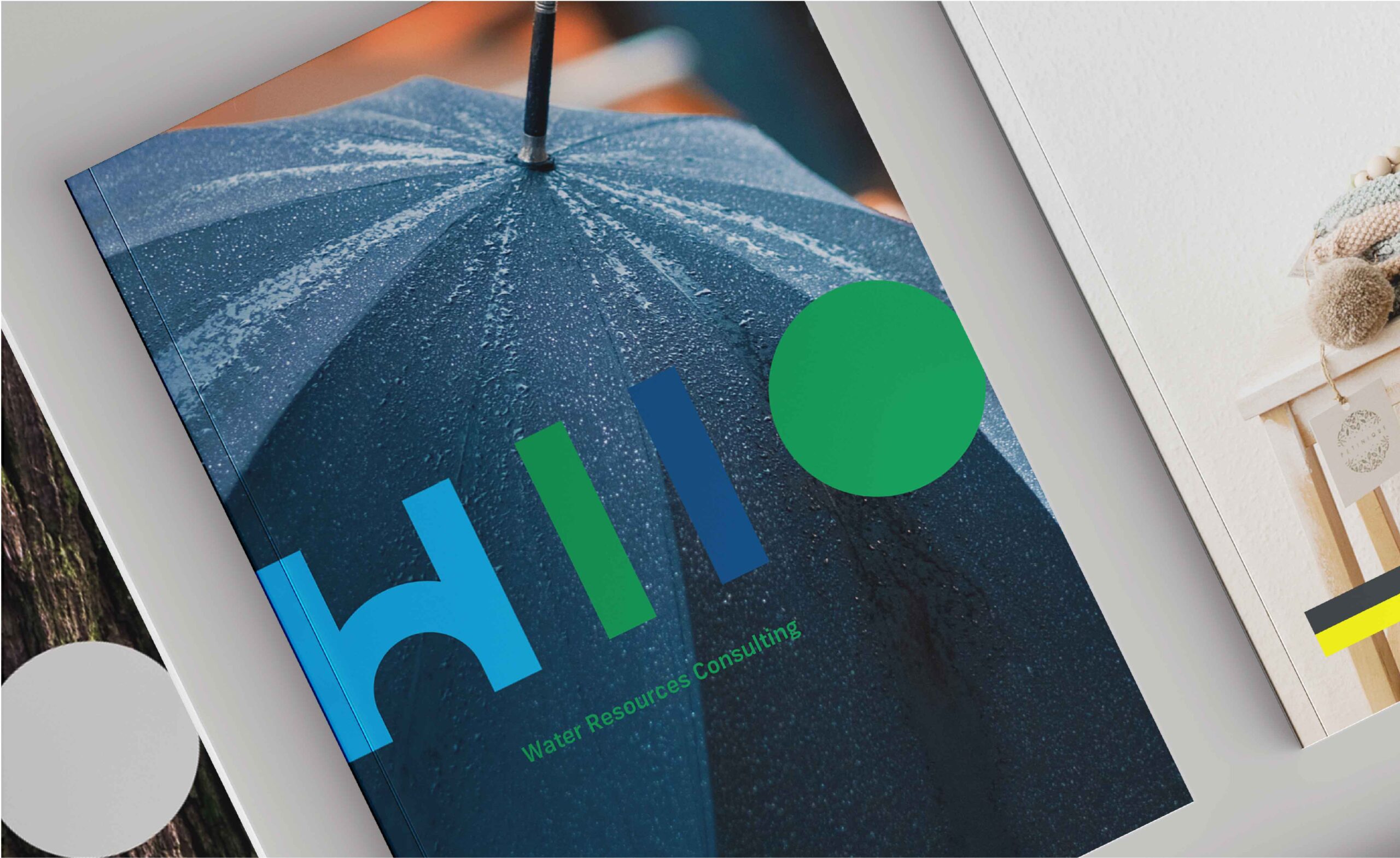
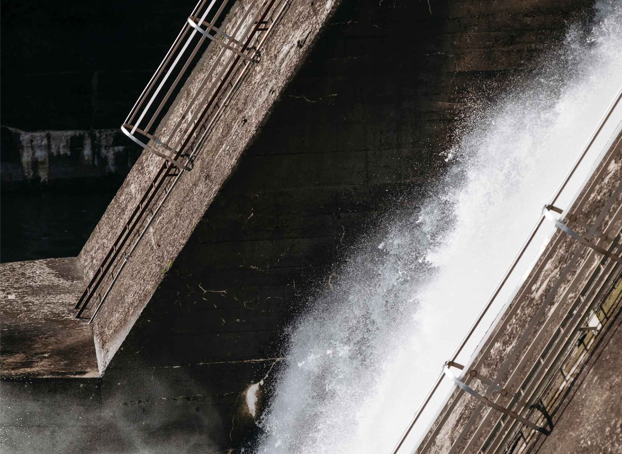
The H II O brand identity inspiration was the blue and green cities; this concept applies worldwide for the recovery of public spaces with the objective to cause a positive impact on the community, as well as the construction of recreation and tourism areas.
For the brand naming, we formulated a name that united the main element of water, along with the first and last name of the client.

As for the color, the approach was to give it a fresh touch, this was accomplished by combining and protecting the hydrological (blue assets due to watercolor) and ecological (green assets due to biodiversity) of the urban landscape.
Isotipo

Moodboard


Motion
Part of our approach is to provide a solution to the client that not only focuses on their visual image but also their brand values. In the project of H II O, we had to create a living modular brand that could be easily applied both digitally and physically.

